


Details & Info
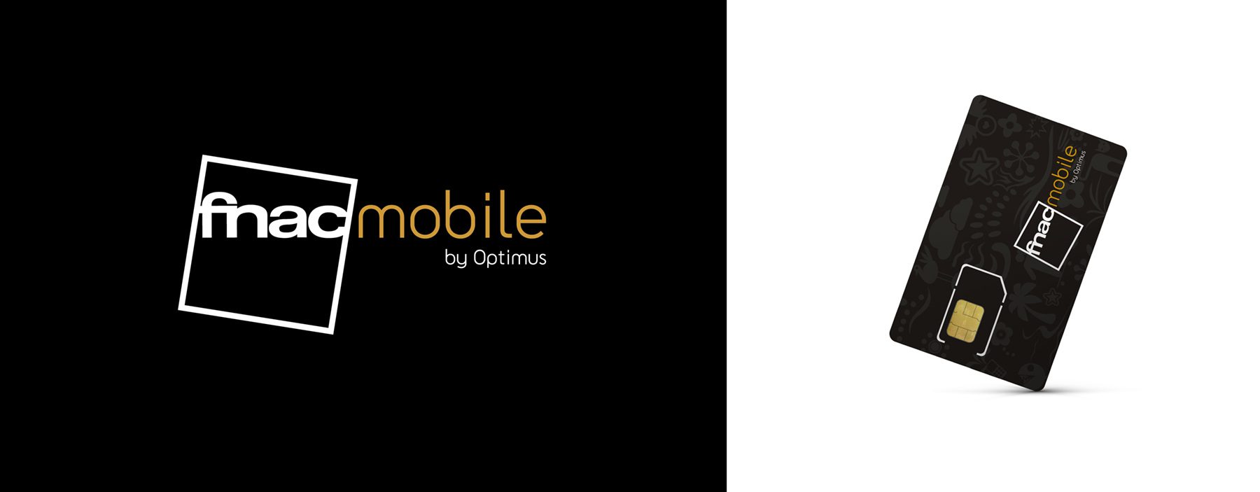
Fnac launched a telecommunications service – Fnac Mobile – which required the development of a distinctive visual identity capable of conveying added value and sophistication. The challenge was to create a strong image aligned with the service’s premium positioning and easily recognisable at the point of sale.
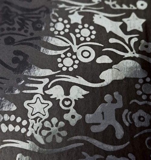
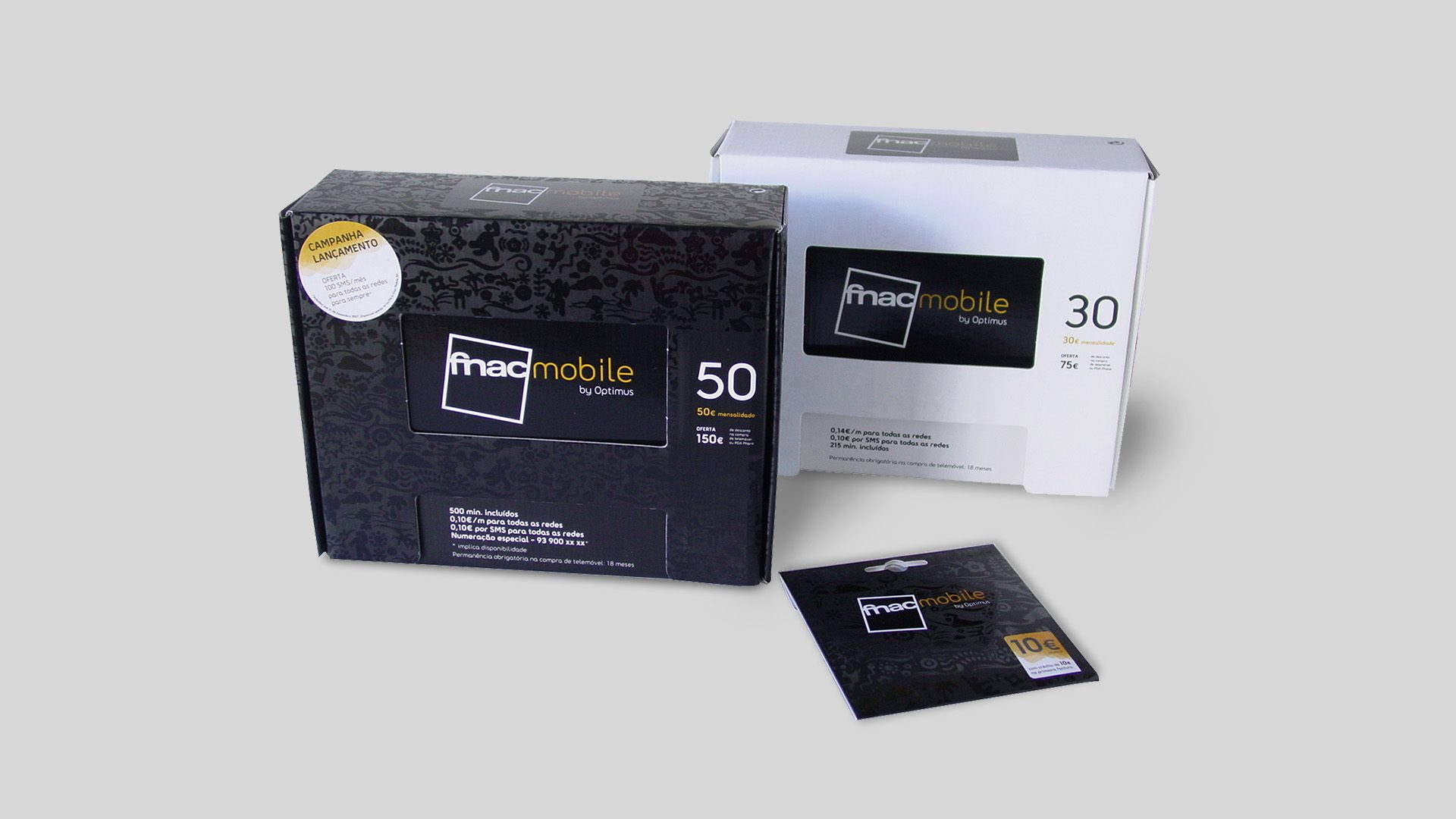
The creative concept was based on the development of an elegant graphic pattern, symbolising life and communication. The use of colour clearly distinguished the two product types, making it easier for consumers to identify and navigate the offer.
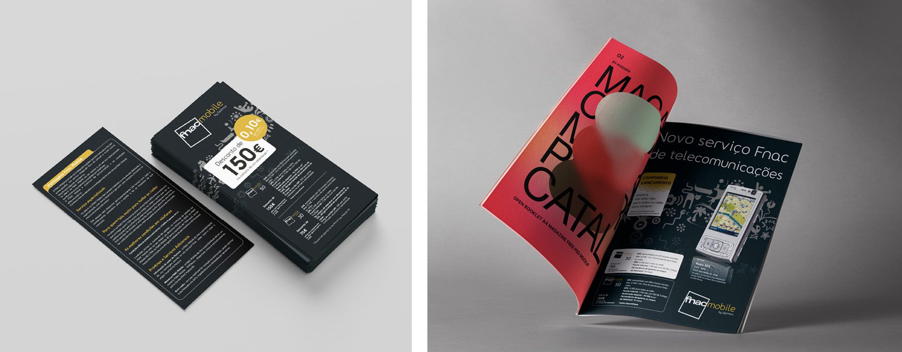
The contrast between matte and glossy finishes reinforced the premium character of the proposal. In addition to the brand identity, the project included the development of packaging, point-of-sale communication materials, ads, and informational flyers, ensuring a coherent and appealing visual experience across all customer touchpoints.


